網站首頁 編程語言 正文
關于echarts各項內容(包括圖表面積區域)設為漸變色已在上篇文章里全部闡述: echarts折線圖與柱狀圖等繪成漸變色的方法
單獨將tooltip拉出來再寫一篇,是因為用formatter配合超文本的形式在echarts的配置項中,于自定義樣式方面很適合各類加工以應付UI和產品那邊提出的各種花里胡哨的設計
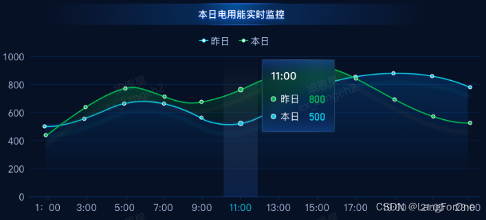
實現效果:
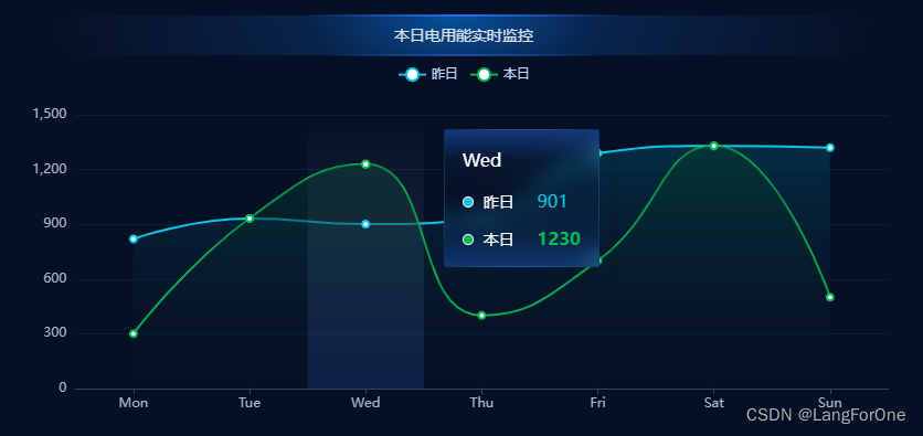
開發頁面過程中寫該模塊樣式時還原出的效果:
實現方法:
1、tooltip的shadow
在tooltip的shadowStyle里進行配置:
        tooltip: {
          trigger: 'axis',
          axisPointer: {
            type: 'shadow',
            shadowStyle: {
              color: new echarts.graphic.LinearGradient(
                0, 0, 0, 1,
                [
                  { offset: 0, color: 'rgba(255, 255, 255, 0)' },
                  { offset: 1, color: 'rgba(37, 107, 230, 0.18)' }
                ]
              ),
            }
          },
        },
2、tooltip的文本框:
這部分沒有特供的配置屬性,直接用formatter配合超文本的形式進行樣式加工:
        tooltip: {
          trigger: 'axis',
          axisPointer: {
            type: 'shadow',
            shadowStyle: {
              color: new echarts.graphic.LinearGradient(
                0, 0, 0, 1,
                [
                  { offset: 0, color: 'rgba(255, 255, 255, 0)' },
                  { offset: 1, color: 'rgba(37, 107, 230, 0.18)' }
                ]
              ),
            }
          },
          backgroundColor: 'rgba(50,50,50,0)', // tooltip默認背景為白色,手動置為透明
          borderWidth: 0,
          formatter: function (params) {
            let html = '';
            html += `<div style="color: #fff;font-size: 16px;height: 125px;padding: 16px;
                      background: linear-gradient(180deg, rgba(37,108,233,0.44) 0%, rgba(23,80,169,0.1) 22%, rgba(20,64,137,0) 46%, rgba(16,51,111,0.28) 77%, rgba(30,101,213,0.4) 100%);
                      border-radius: 2px;border: 1px solid;border-image: radial-gradient(circle, rgba(111, 185, 242, 0.86), rgba(0, 0, 0, 0.2)) 1 1;
                      backdrop-filter: blur(10px);">
                        <div>
                          <div style="margin-bottom: 16px">${params[0].name}</div>
                          <div style="margin-bottom: 12px">
                            <span style="display:inline-block;margin-right:4px;border:1px solid #fff;border-radius:10px;width:10px;height:10px;background-color:#0CC8E6;"></span>
                            <span style="font-size: 14px;">${params[0].seriesName}</span>
                            <span style="margin-left: 16px;color: #0CC8E6;">${params[0].value}</span>
                          </div>
                          <div>
                            <span style="display:inline-block;margin-right:4px;border:1px solid #fff;border-radius:10px;width:10px;height:10px;background-color:#08BA57;"></span>
                            <span style="font-size: 14px;">${params[1].seriesName}</span>
                            <span style="margin-left: 16px;color: #08BA57;font-weight: bold;">${params[1].value}</span>
                          </div>
                        </div>
                      </div>`;
            return html
          },
        },
其中,tooltip的marker圖例可以在formatter的參數中直接拿到: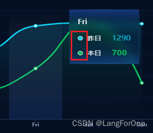
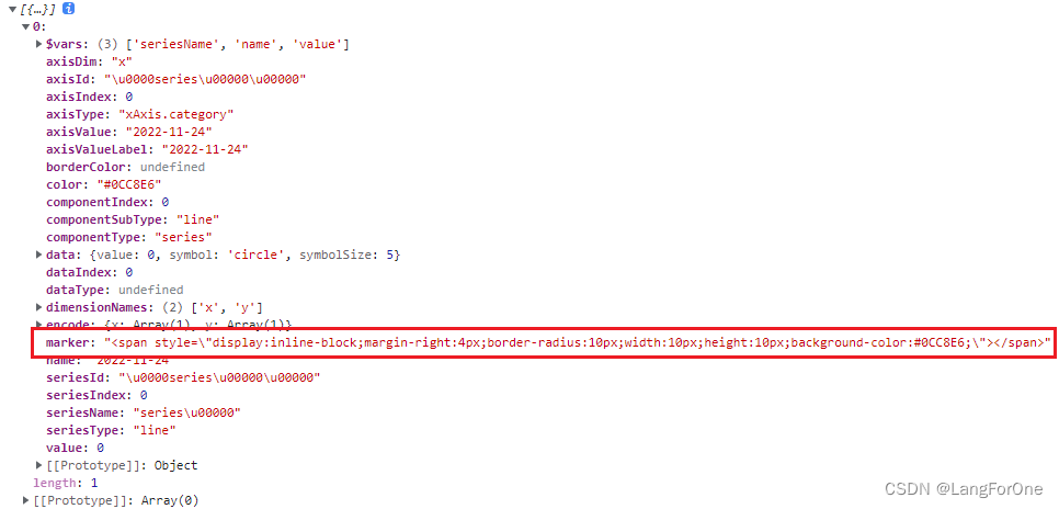
可以直接拿來用也可以自己寫,復制粘貼后記得去掉兩個斜杠\,案例中我是在原有的基礎上加了個白色邊框:
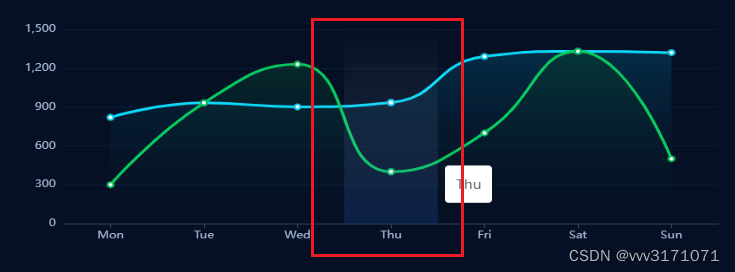
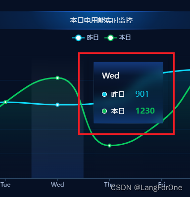
這邊值得一提的是CSS中的backdrop-filter這個屬性,在案例中實現了一個模糊濾鏡的效果
該屬性的各項配置效果具體可參考該文章:css的backdrop-filter
未來有時間再好好研究下這個屬性并將經驗輸出成文章分享給大家~
THX!
原文鏈接:https://blog.csdn.net/vvv3171071/article/details/128102631
- 上一篇:沒有了
- 下一篇:沒有了
相關推薦
- 2022-08-30 MongoDB集合中的文檔管理_MongoDB
- 2022-05-12 Kotlin 擴展函數 之 可空
- 2022-12-16 簡單聊聊Go語言里面的閉包_Golang
- 2022-04-11 python寫入Excel表格的方法詳解_python
- 2022-07-06 如何在React項目中優雅的使用對話框_React
- 2022-09-30 Docker容器Consul部署概述_docker
- 2022-04-11 【Android,kotlin】寫倒計時CountDown的正確姿勢
- 2022-12-16 C++?Futures與Promises線程使用示例講解_C 語言
- 欄目分類
-
- 最近更新
-
- window11 系統安裝 yarn
- 超詳細win安裝深度學習環境2025年最新版(
- Linux 中運行的top命令 怎么退出?
- MySQL 中decimal 的用法? 存儲小
- get 、set 、toString 方法的使
- @Resource和 @Autowired注解
- Java基礎操作-- 運算符,流程控制 Flo
- 1. Int 和Integer 的區別,Jav
- spring @retryable不生效的一種
- Spring Security之認證信息的處理
- Spring Security之認證過濾器
- Spring Security概述快速入門
- Spring Security之配置體系
- 【SpringBoot】SpringCache
- Spring Security之基于方法配置權
- redisson分布式鎖中waittime的設
- maven:解決release錯誤:Artif
- restTemplate使用總結
- Spring Security之安全異常處理
- MybatisPlus優雅實現加密?
- Spring ioc容器與Bean的生命周期。
- 【探索SpringCloud】服務發現-Nac
- Spring Security之基于HttpR
- Redis 底層數據結構-簡單動態字符串(SD
- arthas操作spring被代理目標對象命令
- Spring中的單例模式應用詳解
- 聊聊消息隊列,發送消息的4種方式
- bootspring第三方資源配置管理
- GIT同步修改后的遠程分支
 提供CDN加速